SUN SET
When thinking about Sunsilk what comes to mind? Cricket sounds perhaps? That’s what the majority of thoughts were from people we found hanging around campus.
This lack of brand awareness only highlighted the ABSOLUTE need to change the Sunsilk identity to reposition it in the market.
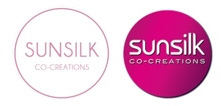
Sunsilk’s image, particularly their logo/packaging reminds us of a brand that is stuck perpetually in the 90s. To us, all we could identify with the brand was it being something once, but nothing important now. A has-been if you must, left to collect dust on the supermarket shelf and only to be bought when you spent all your money partying. What it represents simply doesn’t connect to us through Schmitt’s big 5, leaving the target market little resonance or awareness of the brand.

So, the need to modernise the brand itself to appeal to the target market of young women is an essential change that must occur. Sunsilk has fallen far behind the other more popular brands such as Tresemme’s value for money, Pantene’s strong woman, silky hair presence and Herbal Essences fantastic smelling product.
Through rebranding it to echo the values of people of today, it has the potential to compete with those brands and establish well-needed connections to the consumer. To save Sunsilk’s dying brand we thought we should give it a crack at changing their logo and bring them up to speed!
As logos can provide instant recognition to a brand’s identity, to save Sunsilk’s dying brand we thought we should give it a crack and bring them up to speed!
IN THE DARKNESS

What resonates with the crowds? We drew up an inspirational board for what we young uni students and people close to us thought about brands these days for WHAT we are happy to ASSOCIATE OURSELVES with. Our conclusions? Well, white is in, as is geometrics and you guessed it the basics! We used this information to create something new but also ensure that we didn’t leave all of the old brand behind, clinging onto the remanence of the once beloved hair care brand –ultimately ensuring people kept ‘their hair on side’.

By switching it up with simple colours, shapes and font we have ditched the 90s and moved into the NOW. To fix this, we change the new logo and packaging to captivate the audience with comments like “simple”, “modern”, and “aesthetically pleasing”. You can see for yourself: the literal switch of the base colours with a drop down a couple of shades ensured that the resonance was maintained for repeat customers to their usual products. i.e. pink bottles maintained that little touch of pink.


SUN RISE

The cardinal rule of logo redesigning is that the customer shouldn’t notice. Clearly, we ignored this. But WHY?
1.Three steps behind the zeitgeist of the 21st century in their brand image? This is a do or die situation.
2017, it’s the year of minimalism. The way consumers see brands is rapidly changing, in a fast moving, time-starved world it is difficult to cut through the noise and earn a customer’s attention. Therefore, it is prime time for Sunsilk to come out of the dark ages to re-adjust, reposition and revitalise and fundamentally bring the brand back to basics.
When looking to improve resonance who do you look to? The master of course. And for minimalism that master is Apple. This brand is incontestably cool, cutting edge and irreplaceable. aka brand goals. Based on simplicity, they encapsulate the idea that good logos are recognisable, meaningful and positively affective.
The simplicity of the new Sunsilk logo aims to modernise the brand to connect with the contemporary young woman who is down to earth, lives for the day and by a K.I.S.S. mantra. The logo’s use of negative space allows for calm, whilst the pop of colour creates a positive attitude. Such a high level of naturalness makes it more satisfying to look at, leading to a stronger positive affect. Further, this back to basic’s concept increases the transferability across the range, leaving the brand open to further expansion.
2. Let the brand speak to the people.
Branding is the most successful when your personality matches a company’s personality. So to create resonance with young women, we are telling the story, the whole story, with less. Drawing from other indirect competitors that have had exponentially increasing popularity through Instagram marketing due to their ‘trendy’ minimalistic feeling such as Frank Body and Nars, we purport to reposition Sunsilk to associate it with these cult brands.
Sunsilk’s new logo is effortlessly cool and fun, with new toned down colours and a simplistic layout – a stark contrast to their out-dated 90’s-esque one – creates social currency for the target market as the ‘it’ brand while improving brand judgments of quality.
3. New times. New market placement is calling.
As Sunsilk will establish points of parity from direct competitors such as Tresemme, Pantene and Herbal Essence who aim to WOW consumers with shiny metallics and bright colours, this difference makes our ability increase salience and memorability of the brand within the sea of products for the target market much much easier.
SO, after all of this, we welcome Sunsilk to the dawn of a new brand image.